Final Image Preview
Before we get started, let’s take a look at the image we’ll be creating. Click the screenshot below to view the full-size image. As always, the layered Photoshop file is available via our Psdtuts+ Plus membership.Step 1
The first thing that you need to do is plan a color palette. But in order to choose your colors, you need to understand how the Difference Blending Mode works. It looks at the color information in each channel and subtracts either the blend color from the base color, or the base color from the blend color. This depends on which has the higher brightness value.Difference only works when transforming dark to light, and not light to dark. However, if you apply any type of blur to a difference layer, you’ll get smooth gradients and dynamic lighting. Since the end result needs to be dark, choose bright colors that in combination with a radial blur will create gradients from light to dark.
So begin by opening a new Photoshop document at 1600px by 1280px. Fill the background layer with this color: (#b1c900).

Step 2
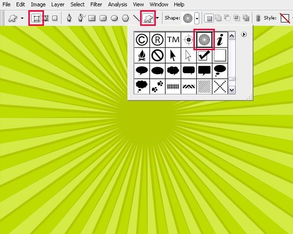
Bring up your Custom Shapes Menu and select the Ray shape, as shown below. You can find it under the Symbols Folder. Then draw the first one right in the middle that is large enough to spread outside the canvas. Use this color: (#bddc01).As soon as you create the first one, duplicate it. Then rotate the copy so that it leaves just a thin line of the background. Then change it to this color: (#d3eb45). You should align them so that they match the image below.
Step 3
At this point, begin painting with a Regular Circle Brush at different sizes. Set your Brush Opacity to 60%, change the color to (#7a263e), and click individually while changing the size for each spot. By manually creating each spot, you have more control over your layout. Once you’ve created the first set, add a few spots on a separate layer with this new color: (#93133d).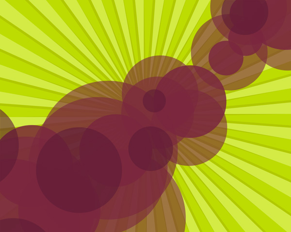
Step 4
Next, make a new layer and add smaller spots with this color (#cdde67). Again, on a separate layer, paint even smaller spots with a slightly more saturated color: (#d9f14a).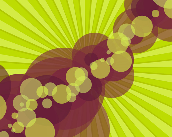
Step 5
Now it’s time to add some contrast by using a saturated version of the color that you used for the very first spots: (#93133d)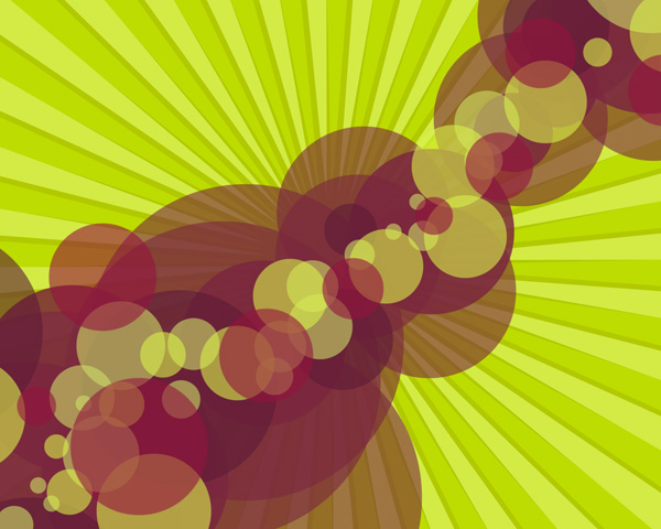
Step 6
To finish off the effect, create some small spots that follow the original layout, and others that fill the unused space of the canvas. Make sure to fade them out gradually as they approach the edge of the canvas. You don’t want those to become distracting later. As a final touch, add a new color that will later be transformed into a vivid pink: (#7b2dc1).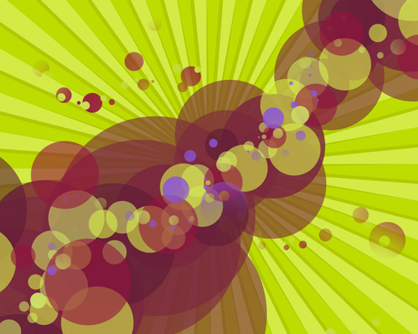
Step 7
As pointed out before, the radial blur effect plays a crucial part in the overall image. Select all the shapes, spots, and background layers and press Ctrl+Shift+E to merge them together. After they are all merged, duplicate the layer. Name this new layer "radial blur". Then go to Filter > Blur > Radial Blur and insert the values shown below.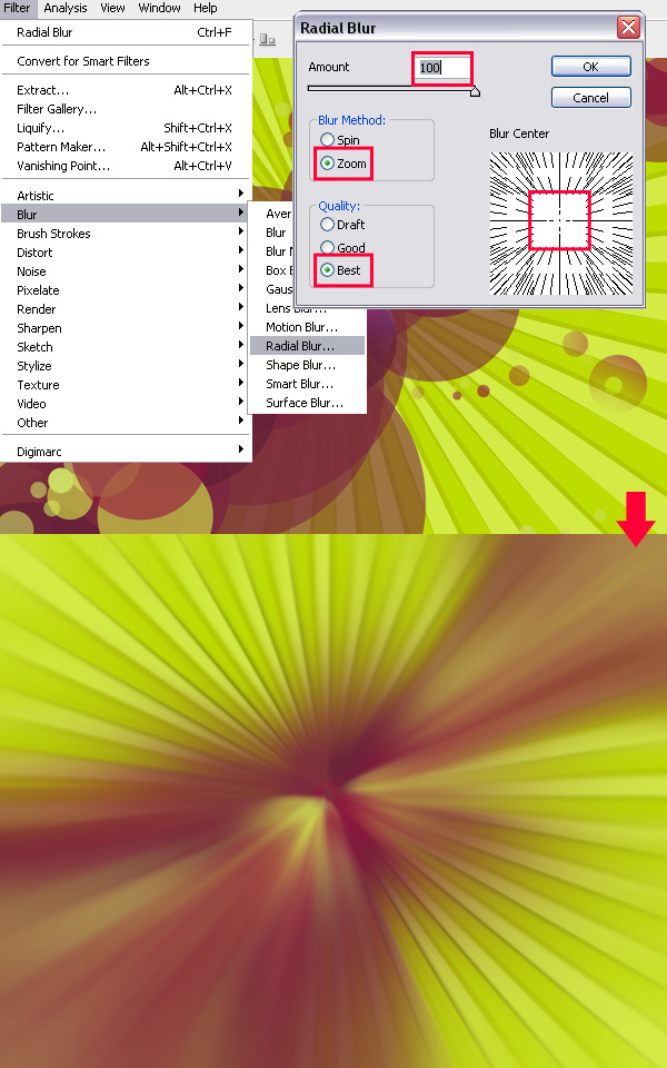
Step 8
You should now have two layers: the background layer that you recently merged together and its duplicated version that you named "radial blur." Select the "radial blur" layer and change its blending mode to Difference. You should now get a dark image with bright green and blue colors. It’s not the hue that we want, so merge both layers together. Then go to Image > Adjustments > Hue/Saturation, or simply press Ctrl+U. Then change the Hue to 73.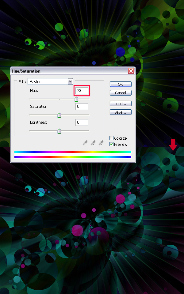
Step 9
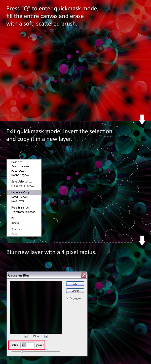
In this step you’ll add some depth to the image that will guide the viewer’s attention to the center of the design. Enter Quickmask Mode (Q), and use the Bucket Tool with the color set on black to fill the whole canvas. Next select the Eraser Tool, and add some scattering to it’s preset.Now drag across the canvas while focusing on the center. As soon as you’re done with that, exit Quickmask Mode (Q) again, and invert the selection by pressing Ctrl+Shift+I. Then right-click on the canvas while the Marquee Tool is selected. Then chose the Layer Via Copy option. As soon as you have the selection in a new layer, go to Filter > Blur > Gaussian Blur, and blur it by 4 pixels.
Step 10
At this point it’s time to add the can. So download this image from stock.xchng. Then cut it out with the Pen Tool. Don’t worry about the bottom, since you will only need the top. Once you have that done, position it in the center, and rotate it at a 45 degree angle. Then change the hue by 180. The use the Burn Tool to darken the lower left half of the can.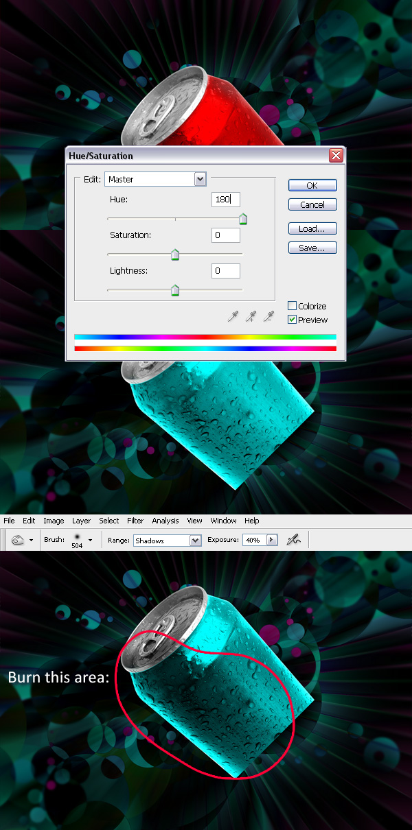
Step 11
Now you need to hide a part of the can in order to fade it into the rest of the photo. A simple layer mask should suffice. So enter Quickmask Mode again. Then fill the entire canvas with black. Erase the part that you want left out with a soft brush. After that, exit Quickmask Mode. Then go to Layer > Layer Mask > Hide Selection. You may also want to sharpen it at this point. To do so, go to Filter > Sharpen > Sharpen.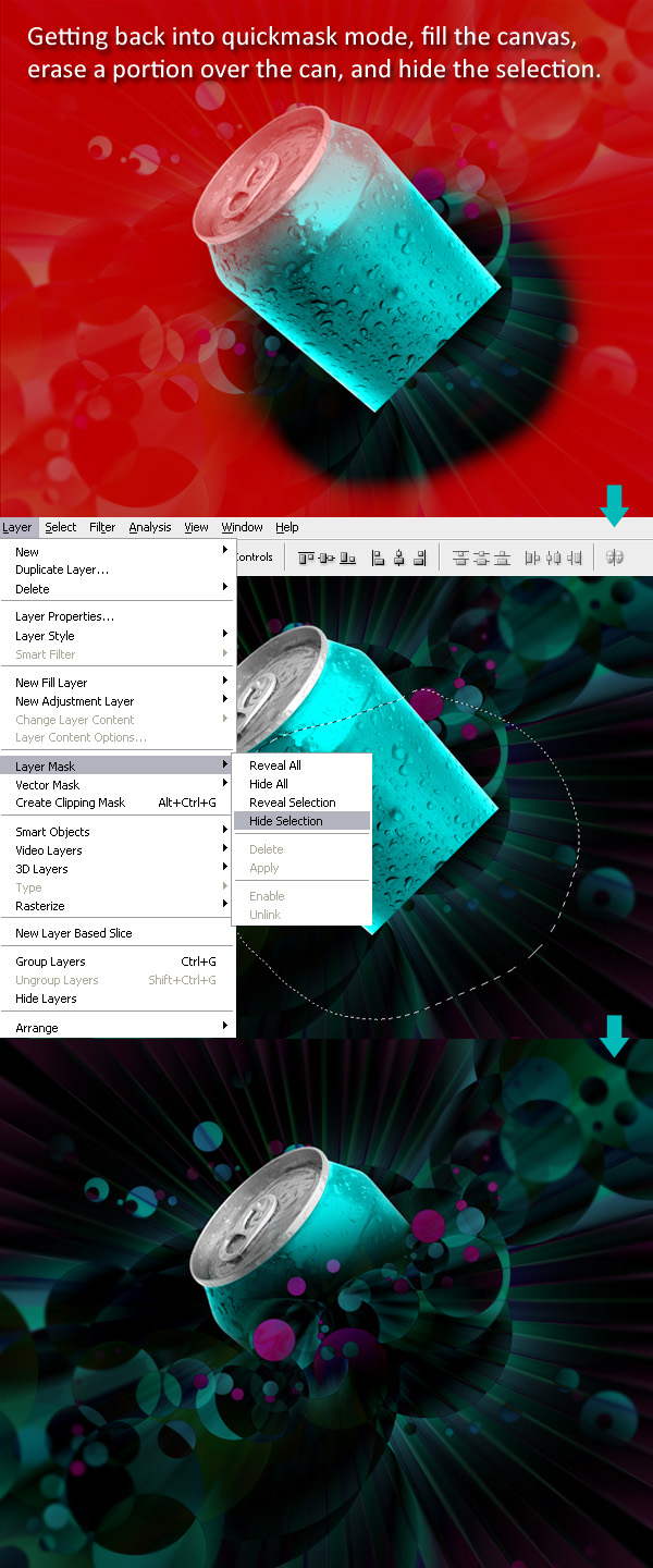
Step 12
Now if you’ll look closely at the photo, you’ll notice that it’s simply too smooth. Rather than adding noise or grunge, we’ll mimic the can texture by using one of Fabio’s tutorials: Creating a Cool Brushed Metal Surface in Photoshop. So first off, fill the canvas area with white. Then go to Filter > Pixelate > Mezzotint. Select Medium Dots and then apply the filter. Then set the layer’s Blending Mode to Color Burn.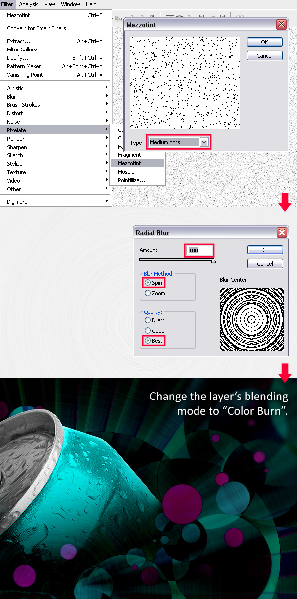
Step 13
In the final step is to add the title on the left side of the canvas. I used a font called Incised901 NdIt BT, which is the abbreviated name for Incised 901 Nord Italic. After typing it in, double-click on the layer, and use the layer style described in the photo below.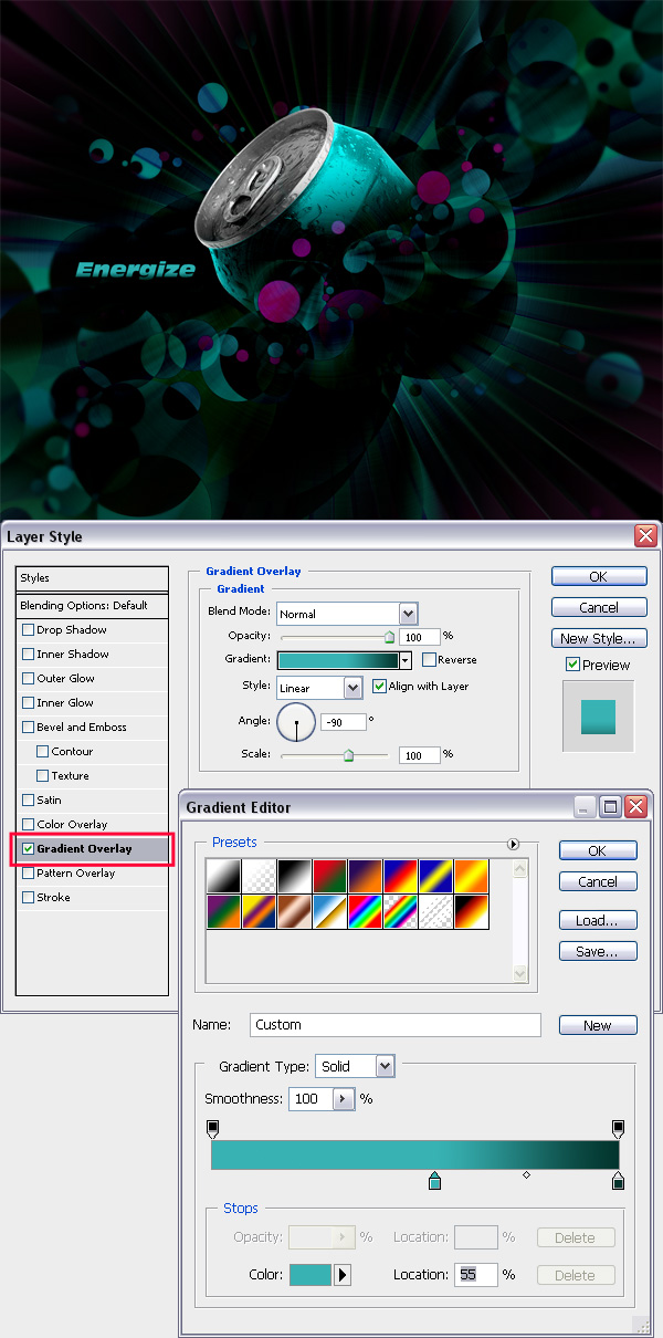
Final Result
And that’s it! One energy drink ad ready to go!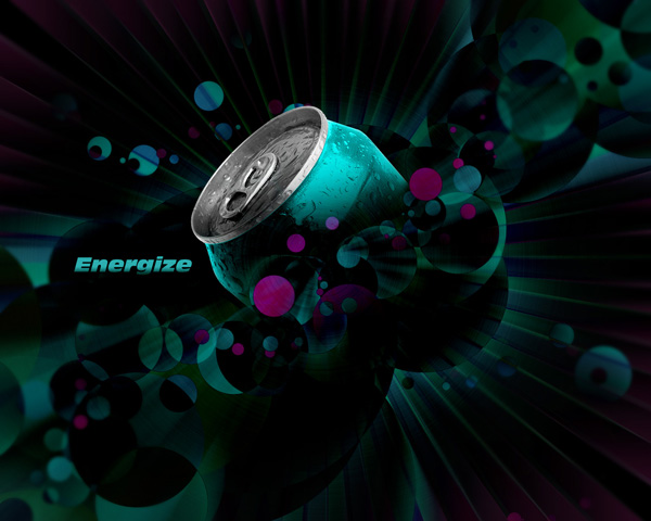
Conclusion
The unique feature of this technique is that it can easily be adapted to suit a variety of different needs. Below is an example of how you can change the outcome simply by modifying the colors and shapes. It’s all up to your creativity! Hopefully you will have found this tutorial helpful and useable in your designs.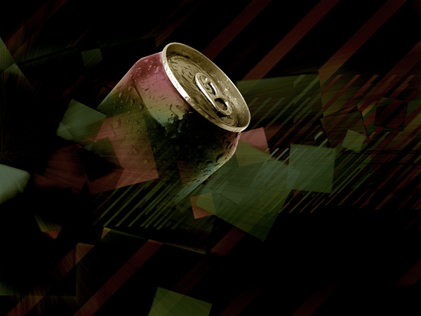

No comments:
Post a Comment